

As much as I like photography, and taking photographs, I don’t discuss photography very much. The truth is I don’t really know much about photography and I am on a learning curve all the time. A few weeks ago a blogger friend asked me to do a blog post on a photo series of Black & White (B+W) photography together with its original coloured photo, which I will do in a few days time. However, regardless of this photo challenge, it’s the B+W photography that made me think.
I love colourful images, I love the vivid colour of landscape or expression of animals and even the vibrancy of a city, I love golden hour as well as blue hour in photography; I look at the formation of the clouds as well as the blueness of the sky. Not that I like HDR, but in short, I don’t enjoy looking at B+W photography, which also made me question my self of why would anyone like to do B+W photography? it’s so old-fashioned and anti technology?
The truth is a lot of people still like to have B+W photography, even some of my architect friends, most of them turned out to be passionate photographers, and are specializing in B+W.
Why did I write this? Actually this is my self-defense in not making a good B+W pictures, and correct me if I am wrong:
1. Not all images can make into a B+W images; some are better as colour images, here is an example:

Vibrant colour of the treads turn bland… why do we want it???
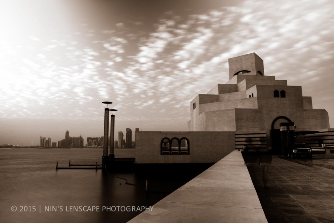
2. Should I convert my colour images to B+W or should I not? Will the result be as vivid as the colour version? this another example:

Difficult to distinguish where is the skyline; the tone between sky-blue and turquoise colour of the water are the same
I think sunset images make a bad B+W image. Check this out as well:

The vibrant and gradation colour of orange looks dull in B+W… or is it supposed to be dull??
A lot of landscape pictures would not make it to B+W images due to the busy detail all over the frame as well as the tonal issue of the colour.
On the other hand architecture photography could make a good B+W images, as it tends to have a plain texture/surface with a contrast curve/angle that creates a good shadow and creates the depth of the space without the requirement of using an open wide aperture.

I think the image does make it to be a B+W photo as you can see the texture of the Lulu’s hair…
I have to accept that B+W makes better decoration for your room/ home compared to colourful landscape images
With that statement, its good to think in B+W and the contrast of the picture prior to shooting the image as you want the result to be B+W. Digital Photography School explains why you can’t just convert any picture to B+W here. which I never do this as I never aim to have B+W as the result.
Having said all that, I have to accept as well that B+W make better decoration for your room/home compared to colourfull landscape images, it’s more neutral, or at least according to me, it makes the whole house decoration look more elegant, but again, don’t mind me, this is only a rant of a soon to be retired architect. There is no definitive correct answer – it’s the one which looks best; it all depends of each of our tastes which one is more beautiful than the other. and its all in the eyes of the beholder….
What about sepia colour?
Any body doesn’t agree with me? then please enlighten me, I would love to hear your opinion….

I think both of them (BW or not) are wonderful in their own way. It’s up to the photographer, in my opinion. Sometimes they think that colorful photos are the most suitable form for an occasion, while for the other, BW photos are simply the best.
I think I could enjoy both :)). They are beautiful images :)).
LikeLike
I agree with you, both photographs are wonderful in their own right provided that you shoot the picture as what it should be. You need to think black and white when you want the result to be black and white.
LikeLike
Same as Gara’s comment above. However, since I love taking pictures of blooming flowers, I prefer colored photos too.
LikeLike
Ha ha ha… that is why, I prefer colour photos as well.
LikeLiked by 1 person
I think it depends on the subject. Mainly I stick to color but occasionally a photo can be much more powerful in B&W. –Curt
LikeLike
I totally agree with you Curt, it all depends on the subject and the background. B+W can be powerful and beautiful, but you need to think B+W before you take the shot, and this resulting a good B+W photo more difficult to produce than normal colour photograph; you cannot convert colour picture to B+W that easy.
This is why I stick to colour photos, easier… 🙂
N.
LikeLike
I wish Ansel Adams were around to join in the discussion. Wouldn’t that be fun. 🙂 –C
LikeLike
Yes, as the master of B+W photography, he could explain better than me… :p
LikeLike
Me too, way better. lol
LikeLike
Aku suka juga BW tapi kadang2 susah dapetin moodnya hehe *duh bahasanya*
LikeLike
Betul… mood nya yang susah di dapet….
LikeLike
Pingback: Looking back to 2015 | Nins' Travelog